

Mobile-Friendly Website Design
Get a fast, responsive, and mobile-friendly website designed for all devices. We create SEO-optimized websites that look perfect on smartphones, tablets, and desktops to improve user experience.
Professional Mobile-Friendly Website Design Services
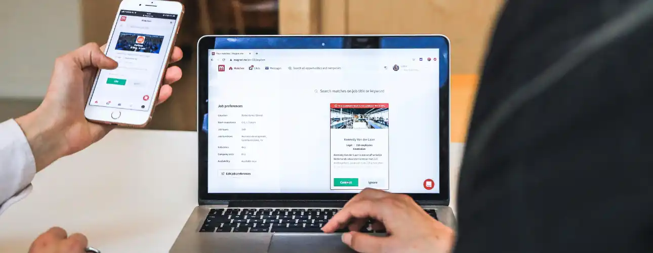
Your customers do not browse your website from one screen size. They may discover your business on a smartphone, compare your services on a tablet and complete an enquiry or purchase from a laptop.
Your website therefore needs to provide a consistent, professional and easy-to-use experience across every important device.
WebCOSS provides custom mobile-friendly website design and responsive web development for businesses that need a modern digital presence built around real users, business goals and long-term growth.
We create responsive websites that automatically adapt their layout, typography, images, navigation, forms, buttons and content according to the available screen size. Rather than simply shrinking a desktop website onto a smaller screen, we carefully plan the mobile user experience so visitors can find information and complete important actions easily.
Whether you require a completely new business website, an existing website redesign, a responsive WordPress website, an ecommerce website or a custom-developed platform, WebCOSS can build a solution around your requirements.
What Is Mobile-Friendly Website Design?Mobile-friendly website design is the process of creating a website that remains clear, usable and functional across different screen sizes and device types.
A properly responsive website adjusts automatically according to the available display area instead of forcing users to zoom, scroll horizontally or struggle with elements designed only for desktop screens.
A professional responsive website should consider much more than changing column widths.
WebCOSS considers:
- Responsive page layouts
- Flexible content containers
- Mobile navigation
- Readable typography
- Touch-friendly buttons
- Responsive images
- Optimised forms
- Accessible content
- Mobile CTAs
- Device-appropriate spacing
- Flexible grids
- Tablet layouts
- Landscape and portrait views
- Responsive tables
- Responsive videos
- Performance optimisation
- Search-friendly structure
The result is one website capable of providing an effective experience across modern smartphones, tablets, laptops and desktop devices.
Why Your Business Needs a Mobile-Friendly WebsiteA website can look impressive on a desktop computer while becoming difficult to use on a smartphone.
Visitors encountering tiny text, overlapping sections, slow-loading images, difficult navigation or buttons that are hard to tap are more likely to leave before understanding what your business offers.
A professionally designed mobile website helps make important actions easier.
Customers can:
- Understand your services quickly
- Navigate between pages easily
- Call your business
- Send an enquiry
- Request a quotation
- Make a booking
- Browse products
- Complete a purchase
- Find your location
- Read important information
- Contact you through WhatsApp
- Access your website from different devices
Mobile optimisation therefore supports both usability and the overall effectiveness of your website.
Mobile-First Website DesignDesigned Around Smaller Screens First
Mobile-first design means considering the requirements of smaller screens early in the design process rather than treating mobile layout as an afterthought.
WebCOSS considers which information visitors need first, which calls to action should remain easy to access and how complex desktop layouts should adapt when available screen space becomes smaller.
This can involve simplifying navigation, reorganising sections, changing grid structures, adjusting typography, resizing media and prioritising important content.
The result is a cleaner and more focused experience for mobile visitors while still delivering a professional desktop website.
Fully Responsive Website DevelopmentEvery responsive project is developed to adapt appropriately across multiple viewport sizes.
Depending on project requirements, we use modern responsive development techniques including:
- Flexible CSS layouts
- CSS Grid
- Flexbox
- Relative sizing
- Responsive containers
- Media queries
- Fluid typography
- Responsive images
- Modern viewport configuration
- Device-independent components
Breakpoints are selected according to the content and layout requirements instead of attempting to design around only a small collection of individual phone models.
Our Mobile-Friendly Website Design Services1. Custom Responsive Website Design
We create responsive interfaces specifically around your business, branding, audience and required functionality.
Instead of forcing your content into a generic layout, the website structure is planned according to your project requirements.
2. Business Website Design
We create professional responsive business websites for companies that need to clearly present their services, credibility, locations, expertise and contact options.
Pages can include:
- Homepage
- About Us
- Service pages
- Industry pages
- Location pages
- Project portfolio
- Testimonials
- FAQs
- Blog
- Contact page
- Quote forms
- Lead-generation sections
Explore WebCOSS Business Website Design services at:
/service/business-website-design
3. Mobile-Friendly WordPress Development
WebCOSS can develop or improve WordPress websites with responsive templates, flexible page sections, optimised content layouts and manageable backend functionality.
We can work with an existing WordPress website or create a new responsive WordPress solution depending on your requirements.
4. Responsive Ecommerce Website Design
An ecommerce website requires particular attention on smaller screens because customers must navigate categories, review products, choose options and complete checkout without unnecessary friction.
Responsive ecommerce development can include:
- Mobile product grids
- Responsive product pages
- Touch-friendly filters
- Product image optimisation
- Mobile search
- Responsive shopping basket
- Streamlined checkout
- Payment integration
- Account pages
- Order tracking
- Mobile CTAs
5. Existing Website Mobile Optimisation
You may not always need a completely new website.
If your existing site performs well in other areas but has mobile usability problems, WebCOSS can review the current implementation and identify practical improvements.
Potential problems include:
- Horizontal scrolling
- Broken layouts
- Small text
- Oversized headings
- Buttons positioned too closely
- Difficult menus
- Oversized images
- Forms overflowing the screen
- Tables breaking layouts
- Popup problems
- Slow mobile loading
- Layout shifts
- Incorrect viewport configuration
- Mobile-specific JavaScript issues
Where appropriate, these problems can be corrected without unnecessarily rebuilding the entire project.
Mobile User Experience DesignResponsive development should support the way people actually interact with smaller screens.
WebCOSS therefore considers the complete mobile journey rather than simply checking whether a page technically fits inside the screen.
We review:
Navigation
Menus should remain easy to understand and operate without covering important content or requiring precise clicks.
Buttons
Important buttons need appropriate spacing and touch areas.
Content Hierarchy
Headings, supporting text, visuals and calls to action should appear in a logical order.
Forms
Contact and enquiry forms should remain practical to complete using a smartphone keyboard.
Calls to Action
Important actions such as Call, WhatsApp, Request a Quote, Book Now or Contact Us can be positioned according to project requirements.
Readability
Font sizes, line spacing, paragraph widths and contrast should make content comfortable to read.
Responsive Navigation DesignNavigation frequently becomes one of the biggest usability problems on mobile websites.
WebCOSS can design responsive navigation systems including:
- Mobile hamburger menus
- Dropdown navigation
- Mega menus
- Sticky mobile navigation
- Search interfaces
- Category navigation
- Account menus
- Ecommerce navigation
- Service menus
- Mobile CTA buttons
Navigation behaviour is tested to ensure important pages remain accessible across different screen sizes.
Fast Mobile Website PerformanceMobile-friendly design and website performance should be considered together.
A responsive website can still provide a poor experience if it loads unnecessary scripts, oversized images or excessive resources.
WebCOSS considers performance throughout the project.
Optimisation may include:
- Modern image formats
- Correctly sized images
- Responsive image delivery
- Image compression
- Lazy loading where appropriate
- CSS optimisation
- JavaScript optimisation
- Reduced unnecessary scripts
- Browser caching
- Server caching
- Font optimisation
- Database optimisation
- CDN configuration where appropriate
- Hosting recommendations
- Core Web Vitals considerations
The exact performance work depends on the website technology, hosting environment and project scope.
Responsive Images and MediaLarge desktop images should not automatically become unnecessarily heavy downloads for mobile visitors.
Where appropriate, WebCOSS configures responsive images and media so browsers can select more suitable resources for the available display.
We also consider:
- Image aspect ratios
- Width and height attributes
- Layout stability
- Image compression
- WebP or other appropriate formats
- Background images
- Hero banners
- Videos
- Galleries
- Product images
- Portfolio images
This helps maintain visual quality while avoiding unnecessary resource usage.
Mobile-Friendly FormsForms are often an important conversion point for service websites.
We create responsive forms designed to remain usable across smartphones, tablets and desktops.
Depending on requirements, forms may include:
- Contact forms
- Quote request forms
- Booking enquiries
- Callback requests
- Newsletter forms
- Consultation requests
- Account registration
- Login forms
- Custom enquiry forms
Fields, validation messages, buttons and error states are designed so users can complete the process without struggling with the interface.
Mobile-Friendly SEOResponsive website development also contributes to a stronger technical foundation for search optimisation.
WebCOSS builds pages with SEO-ready considerations such as:
- Crawlable page structure
- Logical headings
- Semantic HTML
- Responsive content
- Clean URLs
- Metadata support
- Canonical configuration
- Image alt attributes
- Internal linking
- Structured content
- Page performance considerations
- Mobile usability
- Accessible navigation
- Schema markup where appropriate
- XML sitemap compatibility
- Search-friendly page architecture
SEO results depend on many factors including content quality, competition, authority, technical health and ongoing optimisation, so rankings cannot be guaranteed simply by making a website responsive.
For additional optimisation, combine this service with WebCOSS SEO and Digital Growth services.
Custom Mobile-Friendly Web DevelopmentSome businesses require more than a standard informational website.
WebCOSS can combine responsive design with custom web development to create websites and platforms with project-specific functionality.
Possible functionality includes:
- Customer dashboards
- Booking systems
- Reservation platforms
- Membership areas
- Customer portals
- Admin dashboards
- Product configurators
- Quote systems
- Custom forms
- User accounts
- Search systems
- API integrations
- CRM integrations
- Payment functionality
- Business workflow tools
- Reporting dashboards
Explore:
Custom Web Development/service/custom-web-development
Before launch, responsive behaviour should be checked across representative screen sizes and modern browsers.
Testing can include:
- Mobile layouts
- Tablet layouts
- Desktop layouts
- Portrait orientation
- Landscape orientation
- Navigation
- Buttons
- Forms
- Images
- Videos
- Popups
- Sliders
- Accordions
- Tables
- Search functionality
- Interactive components
- Internal links
- Contact actions
The testing scope is determined according to the technology and functionality included in the project.
Accessibility ConsiderationsMobile-friendly development should also consider users with different accessibility requirements.
Depending on project scope, WebCOSS considers:
- Logical heading structures
- Keyboard-friendly navigation
- Form labels
- Alternative image text
- Readable typography
- Colour contrast
- Focus states
- Semantic markup
- Zoom compatibility
- Clear link and button labels
Accessibility requirements can be discussed during project planning where specific standards or compliance targets apply.
FeaturesKey Features of Our Mobile-Friendly Website Design
01. Fully Responsive Design
Your website adapts across smartphones, tablets, laptops and desktop displays.
02. Mobile-First UX
Important information and conversion actions are prioritised for smaller screens.
03. Custom Website Design
Layouts are created around your brand, audience and business requirements rather than forcing every project into the same template.
04. Fast Loading Pages
Images, scripts and website resources are considered with performance in mind.
05. SEO-Ready Structure
Responsive layouts, crawlable navigation and structured content provide a practical foundation for ongoing SEO.
06. Touch-Friendly Navigation
Menus, links, buttons and interactive elements are designed with mobile interaction in mind.
07. Responsive Images
Images adapt according to screen size while performance and layout stability are considered.
08. Responsive Forms
Forms remain practical to complete across different screen sizes.
09. Cross-Browser Compatibility
Important functionality is reviewed across representative modern browser environments.
10. Conversion-Focused Layouts
Calls to action are positioned around the goals of your website, whether that is generating enquiries, bookings, registrations or sales.
11. WordPress Development
Mobile-responsive WordPress websites can be created with manageable backend functionality.
12. Ecommerce Compatibility
Responsive product browsing, cart and checkout experiences can be developed for online stores.
13. Custom Functionality
APIs, dashboards, bookings, accounts and other custom functionality can be integrated where required.
14. Security Considerations
Secure development practices, permissions, updates and appropriate configuration are considered according to the selected platform.
15. Scalable Development
The website structure can be planned with future pages, services and functionality in mind.
16. Ongoing Support
WebCOSS can continue with maintenance, optimisation, SEO, content updates and development after launch.
Why Choose WebCOSS?Why Choose Us for Mobile-Friendly Website Design?
Custom Design, Not Just Desktop Resizing
We consider how each important section should function on smaller screens rather than simply reducing the size of a desktop design.
Business-First Planning
Before deciding how the website should look, we consider what users need to accomplish and what your business needs the website to achieve.
Responsive Development Built Into the Project
Mobile compatibility is part of development from the beginning rather than something added after the desktop website has been completed.
Design and Development Together
WebCOSS combines front-end design, development, technical implementation and optimisation within the same delivery process.
SEO-Aware Development
Technical structure, mobile usability, internal navigation and performance considerations can be incorporated during development.
Performance Awareness
We consider images, scripts, fonts, plugins, caching and other factors that can influence website loading performance.
Flexible Technology
Depending on your project requirements, WebCOSS can work with WordPress, ecommerce platforms or custom web development.
Built for Real Business Requirements
Your website can include the forms, integrations, functionality, user journeys and administrative tools your organisation actually needs.
Support After Launch
A website changes over time. WebCOSS can continue supporting updates, maintenance, new features, SEO and performance improvements after launch.
Who Is This Service For?Our mobile-friendly website design service is suitable for:
- Startups
- Small businesses
- Growing companies
- Professional service providers
- Restaurants
- Hospitality businesses
- Event companies
- Property businesses
- Accountants
- Consultants
- Healthcare organisations
- Retail businesses
- Ecommerce companies
- Educational organisations
- SaaS businesses
- B2B companies
- Local businesses
- Organisations replacing outdated websites
Building a New Website
A new project allows the responsive structure to be planned from the beginning around your branding, content, audience and functionality.
Improving an Existing Website
If you already have a website, we can review its existing structure and determine whether targeted responsive improvements or a broader redesign is more appropriate.
There is no reason to rebuild functionality that already works correctly unless replacing it provides a practical benefit.
Our Mobile-Friendly Website Design Process01. Discovery and Requirements
We review your business, target audience, existing website, competitors, content, technical requirements and project goals.
02. Website Structure
Pages, navigation, user journeys, conversion points and content hierarchy are planned.
03. Responsive UX Planning
Layouts are considered across mobile, tablet and desktop screen sizes.
04. Design and Development
The approved direction is converted into responsive website components and required functionality.
05. Content Integration
Business content, images, calls to action, metadata and important internal links are added.
06. Mobile Testing
Navigation, forms, sections, media and functionality are checked across representative viewport sizes.
07. Performance and Technical Review
Images, scripts, page structure, metadata and relevant performance considerations are reviewed.
08. Launch
Following approval and final checks, the website is deployed to the appropriate environment.
09. Ongoing Improvement
Maintenance, SEO, performance optimisation, content and additional functionality can continue after launch.
Technologies We Can Work WithDepending on project requirements, responsive website development may involve:
- HTML5
- CSS3
- JavaScript
- PHP
- WordPress
- WooCommerce
- MySQL
- REST APIs
- Bootstrap
- Modern CSS Grid
- Flexbox
- Custom CMS functionality
- Third-party integrations
Technology is selected according to the actual project rather than adding unnecessary frameworks or dependencies.
Combine Mobile-Friendly Design With Other WebCOSS ServicesA responsive website can be combined with other WebCOSS capabilities.
Custom Web Development
Create project-specific functionality, workflows and integrations.
Internal Link: /service/custom-web-development
Business Website Design
Build a professional website designed to communicate your services and generate enquiries.
Internal Link: /service/business-website-design
SEO & Digital Growth
Improve technical SEO, content structure, keyword targeting and organic search visibility.
Ecommerce Website Development
Build a responsive online store with mobile product browsing and checkout functionality.
Website Maintenance & Support
Keep the website updated, secure and performing effectively after launch.
Web Apps & Portals
Develop responsive dashboards, customer portals and browser-based business applications.
Useful ResourcesFor businesses wanting to understand responsive development in more detail, useful industry resources include:
- Google Search Central — Mobile-First Indexing Best Practices
- web.dev — Responsive Web Design Basics
- WebCOSS Custom Web Development
- WebCOSS Business Website Design
- WebCOSS Projects & Portfolio
- WebCOSS Pricing
- WebCOSS Contact
Need a Mobile-Friendly Website That Works Across Every Screen?
Whether you are launching a new website or improving an existing one, WebCOSS can help you create a responsive, fast and professional website built around your business requirements.
Tell us about your current website, target audience, required functionality and business goals. We can review the project and recommend a practical approach.
Primary CTA: Discuss Your Website Project
Secondary CTA: View Our Projects
Suggested Links:
- Contact →
/contact - Projects →
/projects - Services →
/services - Custom Web Development →
/service/custom-web-development - Business Website Design →
/service/business-website-design
1. What is a mobile-friendly website?
A mobile-friendly website is designed so visitors can comfortably access content, navigation and functionality across smartphones and other smaller screens without needing to zoom or scroll horizontally.
2. What is responsive website design?
Responsive website design allows the layout and components of a website to adapt automatically according to available screen size. The same website can therefore provide suitable layouts for phones, tablets, laptops and desktop devices.
3. Does WebCOSS build fully responsive websites?
Yes. WebCOSS develops responsive websites with layouts, navigation, content, forms, media and functionality designed to work across common screen sizes and device types.
4. Can you make my existing website mobile-friendly?
Yes. We can review an existing website and identify responsive layout, navigation, performance and usability issues. Depending on its condition, targeted improvements may be sufficient or a broader redesign may be recommended.
5. Is mobile-friendly design important for SEO?
Mobile usability is an important technical consideration for modern websites. Google primarily uses the mobile version of website content for indexing, so mobile content, crawlability and usability should be considered as part of an overall SEO strategy.
6. Will my website work on tablets as well?
Yes. Responsive development considers intermediate screen sizes such as tablets as well as smartphones and desktop computers.
7. Do you build mobile-friendly WordPress websites?
Yes. WebCOSS can develop responsive WordPress websites and improve existing WordPress sites where mobile layout or usability needs attention.
8. Can you build a mobile-friendly ecommerce website?
Yes. Ecommerce projects can include responsive product listings, product pages, filters, baskets, checkout interfaces and customer account sections.
9. Can you improve mobile website speed?
Yes. Depending on the project, improvements can include image optimisation, script reduction, caching, font optimisation, code improvements and other performance work.
10. Will you test the website before launch?
Yes. Relevant layouts, navigation, forms, links, functionality and responsive behaviour are reviewed before launch according to the agreed scope.
11. Can you add WhatsApp, click-to-call and enquiry buttons?
Yes. Mobile-specific conversion actions such as telephone links, WhatsApp buttons, booking links and enquiry CTAs can be integrated according to your requirements.
12. Do you provide website maintenance after launch?
Yes. WebCOSS can provide ongoing website maintenance, security updates, content updates, technical support, performance improvements and additional development.